 Vue.js

前言
本篇文章是为了锻炼自己的技术能力还有底子,模仿element-ui进行开发的UI库。 纯属学习使用。本文利用Vue-Cli4进行构建。css预编译器用的sass
文档地址这里
可能会挂掉。因为是直接npm run docs:dev 一旦关闭就不能登陆了。
说一下文档。进去会有点慢。
- 服务器原因。
- 没有打包 启动的node服务。(打包因为使用了
vue组件,所以出现错误。目前我还不会解决。有大能可以帮忙解决一下最好) - 附上截图
github地址 这里
本次大大小小总共写了 12 组件。分别是
- Button组件
- Layout 布局组件
- Container 容器组件
- input 输入框组件
- Upload 上传组件
- DatePick 日历组件
- Switch 开关组件
- infinteScroll 无线滚动指令
- Message 通知组件
- Popover 弹出框组件
- 分页组件
- table 表格组件
大概就这么多。废话不多说,接下来开始进行每个组件的解析和创建
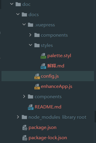
代码结构
ui
|-- undefined
    |-- .browserslistrc
    |-- .editorconfig
    |-- .eslintrc.js
    |-- .gitignore
    |-- babel.config.js
    |-- karma.conf.js  //karma 配置
    |-- package-lock.json
    |-- package.json
    |-- packeage解释.txt
    |-- README.md
    |-- services.js  // 文件上传服务器
    |-- vue.config.js
    |-- dist // 打包后
    |   |-- ac-ui.common.js
    |   |-- ac-ui.common.js.map
    |   |-- ac-ui.css
    |   |-- ac-ui.umd.js
    |   |-- ac-ui.umd.js.map
    |   |-- ac-ui.umd.min.js
    |   |-- ac-ui.umd.min.js.map
    |   |-- demo.html
    |-- public
    |   |-- 1.html
    |   |-- favicon.ico
    |   |-- index.html
    |-- src  // 主文件夹
    |   |-- App.vue
    |   |-- main.js
    |   |-- assets
    |   |   |-- logo.png
    |   |-- components   // 测试用例
    |   |   |-- ButtonTest.vue
    |   |   |-- ContainerTest.vue
    |   |   |-- DatePickTest.vue
    |   |   |-- FormTest.vue
    |   |   |-- InfiniteScrollTest.vue
    |   |   |-- LayoutTest.vue
    |   |   |-- MessageTest.vue
    |   |   |-- paginationTest.vue
    |   |   |-- PopoverTest.vue
    |   |   |-- SwitchTest.vue
    |   |   |-- TableTest.vue
    |   |-- packages // UI
    |   |   |-- index.js
    |   |   |-- infiniteScroll.js
    |   |   |-- progress.vue
    |   |   |-- button
    |   |   |   |-- Button.vue
    |   |   |   |-- ButtonGroup.vue
    |   |   |   |-- Icon.vue
    |   |   |-- container
    |   |   |   |-- aside.vue
    |   |   |   |-- container.vue
    |   |   |   |-- footer.vue
    |   |   |   |-- header.vue
    |   |   |   |-- main.vue
    |   |   |-- datePack
    |   |   |   |-- date-pick.vue
    |   |   |   |-- date-range-pick.vue
    |   |   |-- Form
    |   |   |   |-- ajax.js
    |   |   |   |-- input.vue
    |   |   |   |-- upLoad-drag.vue
    |   |   |   |-- upLoad.vue
    |   |   |-- layout
    |   |   |   |-- Col.vue
    |   |   |   |-- Row.vue
    |   |   |-- Message
    |   |   |   |-- index.js
    |   |   |   |-- Message.vue
    |   |   |-- pagination
    |   |   |   |-- pagination.vue
    |   |   |-- popover
    |   |   |   |-- popover.vue
    |   |   |-- switch
    |   |   |   |-- Switch.vue
    |   |   |-- Table
    |   |       |-- Table.vue
    |   |-- styles // 全局样式
    |       |-- icon.js
    |       |-- mixin.scss
    |       |-- _var.scss
    |-- tests // 测试用例
    |   |-- button.spec.js
    |   |-- col.spec.js
    |-- uploads   // 文件上传路径
        |-- 1.js
通用代码
样式
// styles/_var
$border-radius: 4px;

$primary: #409EFF;
$success: #67C23A;
$warning: #E6A23C;
$danger: #F56C6C;
$info: #909399;

$primary-hover: #66b1ff;
$success-hover: #85ce61;
$warning-hover: #ebb563;
$danger-hover: #f78989;
$info-hover: #a6a9ad;

$primary-active: #3a8ee6;
$success-active: #5daf34;
$warning-active: #cf9236;
$danger-active: #dd6161;
$info-active: #82848a;

$primary-disabled: #a0cfff;
$success-disabled: #b3e19d;
$warning-disabled: #f3d19e;
$danger-disabled: #fab6b6;
$info-disabled: #c8c9cc;

$--xs: 767px !default;
$--sm: 768px !default;
$--md: 992px !default;
$--lg: 1200px !default;
$--xl: 1920px !default;

$map: (
        "xs":(max-width:$--xs),
        "sm":(min-width:$--sm),
        "md":(min-width:$--md),
        "lg":(min-width:$--lg),
        "xl":(min-width:$--xl),
);
* {
  padding: 0;
  margin: 0;
  box-sizing: border-box;
}
混入函数
//flex布局复用
@import "var";
@mixin flexSet($dis:flex,$hov:space-between,$ver:middle,$col:center) {
display: $dis;
justify-content: $hov; // 主轴对齐方式
align-items: $col;
vertical-align: $ver // 图片对其
};
@mixin position($pos:absolute,$top:0,$left:0,$width:100%,$height:100%){
position: $pos;
top: $top;
left: $left;
width: $width;
height: $height;
};
@mixin res($key) {
// inspect Map 无法转换为纯 CSS。使用一个作为 CSS 函数的变量或参数的值将导致错误。使用inspect($value)函数来生成一个对调试 map 有用的输出字符串。
@media only screen and #{inspect(map_get($map,$key))}{
@content //插槽
}
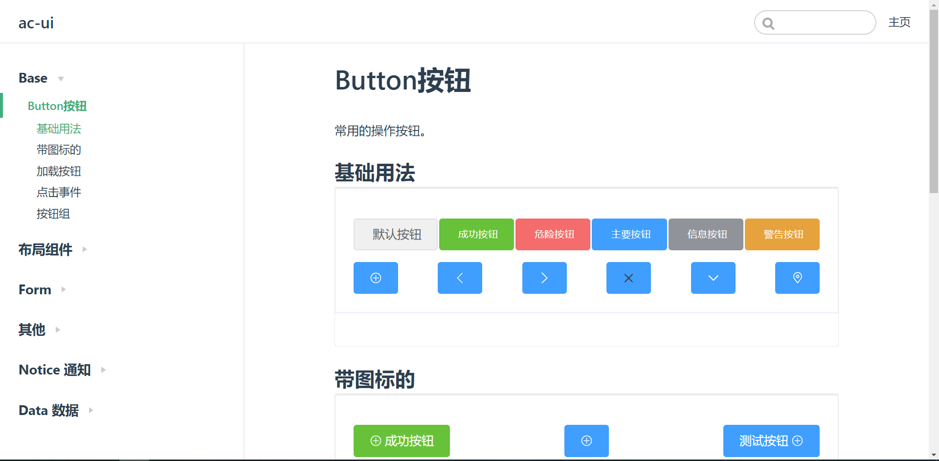
}Button 组件
Button
首先要确认的是,Button都有哪些常用的属性
type类型,分别控制按钮不同的颜色icon字体图标。看按钮是否要带有图标iconPosition字体图标的位置。loading加载状态disable和loading一起控制- 以下没有实现,感觉比较简单。所以偷个懒
size按钮大小 (这里我就偷懒了,感觉这个比较好实现)radio圆角 也就是加一个border-radius
暂时就想到这么多。先实现把
html结构
<template>
  <button class="ac-button" :class="btnClass" :disabled="loading" @click="$emit('click',$event)">
    <ac-icon v-if="icon  && !loading" :icon="icon" class="icon"></ac-icon>
    <ac-icon v-if="loading" icon="xingzhuang" class="icon"></ac-icon>
    <span v-if="this.$slots.default">
      <slot></slot>
    </span>
  </button>
</template>
这段代码应该比较容易理解。注意点
- 我是利用
order来进行 图标位置的前后,也可以再span后面在加上一个ac-icon用if判断即可 @click事件是需要触发 父级click事件。如果有其他需要还可以继续添加
JS部分
<script>
  export default {
    name: 'ac-button',
    props: {
      type: {
        type: String,
        default: '',
        validator(type) {
          if (type && !['waring', 'success', 'danger', 'info', 'primary'].includes(type)) {
            console.error('type类型必须是' + ['waring', 'success', 'danger', 'info', 'primary'].join(','))
          }
          return true
        }
      },
      icon: {
        type: String
      },
      iconPosition: {
        type: String,
        default: 'left',
        validator(type) {
          if (type && !['left', 'right'].includes(type)) {
            console.error('type类型必须是' + ['left', 'right'].join(','))
          }
          return true
        }
      },
      loading: {
        type: Boolean,
        default: false
      }
    },
    computed: {
      btnClass() {
        const classes = []
        if (this.type) {
          classes.push(`ac-button-${ this.type }`)
        }
        if (this.iconPosition) {
          classes.push(`ac-button-${ this.iconPosition }`)
        }
        return classes
      }
    }
  }
</script>js部分这里面也好理解。主要解释一下以下部分
validator,自定义校验器 参考文档computed根据传入属性动态绑定class,有好几种方法,这里只是其中一种
css部分
<style lang="scss">
  @import "../../styles/var";
  @import "../../styles/mixin";

  $height: 42px;
  $font-size: 16px;
  $color: #606266;
  $border-color: #dcdfe6;
  $background: #ecf5ff;
  $active-color: #3a8ee6;
  .ac-button {
    border-radius: $border-radius;
    border: 1px solid $border-color;
    height: $height;
    color: $color;
    font-size: $font-size;
    line-height: 1;
    cursor: pointer;
    padding: 12px 20px;
    @include flexSet($dis: inline-flex, $hov: center);
    user-select: none; // 是否可以选中文字
    &:hover, &:focus {
      color: $primary;
      border-color: $border-color;
      background-color: $background;
    }

    &:focus {
      outline: none;
    }

    &:active {
      color: $primary-active;
      border-color: $primary-active;
      background-color: $background;
    }

    @each $type, $color in (primary:$primary, success:$success, danger:$danger, waring:$warning, info:$info) {
      &-#{$type} {
        background-color: $color;
        border: 1px solid $color;
        color: #fff;
      }
    }

    @each $type, $color in (primary:$primary-hover, success:$success-hover, danger:$danger-hover, waring:$warning-hover, info:$info-hover) {
      &-#{$type}:hover, &-#{$type}:focus {
        background-color: $color;
        border: 1px solid $color;
        color: #fff;
      }
    }

    @each $type, $color in (primary:$primary-active, success:$success-active, danger:$danger-active, waring:$warning-active, info:$info-active) {
      &-#{$type}:active {
        background-color: $color;
        border: 1px solid $color;
        color: #fff;
      }
    }

    @each $type, $color in (primary:$primary-disabled, success:$success-disabled, danger:$danger-disabled, waring:$warning-disabled, info:$info-disabled) {
      &-#{$type}[disabled] {
        cursor: not-allowed;
        color: #fff;
        background-color: $color;
        border-color: $color;
      }
    }

    .icon {
      width: 16px;
      height: 16px;
    }

    &-left {
      svg {
        order: 1
      }

      span {
        order: 2;
        margin-left: 4px;
      }
    }

    &-right {
      svg {
        order: 2
      }

      span {
        order: 1;
        margin-right: 4px;
      }
    }
  }
</style>css的button样式相对比较简单。
提一下Sass @each用法。参考文档
就是一个循环,可以循环 数组 或者 对象,类似 python的for循环
Icon
这个也比较简单 就直接上代码了
<template>
  <svg class="ac-icon" aria-hidden="true" @click="$emit('click')">
    <use :xlink:href="`#icon-${icon}`"></use>
  </svg>
</template>

<script>
  import '../../styles/icon.js'

  export default {
    name: 'ac-icon',
    props:{
      icon:{
        type: String,
        require: true
      }
    }
  }
</script>

<style lang="scss">
  .ac-icon {
    width: 25px;
    height:25px;
    vertical-align: middle;
    fill: currentColor;
  }
</style>
ButtonGroup
这个就比较简单了。就是利用插槽,内容填充一下。然后更改一下样式即可。
当然 也可以写一个报错信息
<template>
<div class="ac-button-group">
<slot></slot>
</div>
</template>
<script>
export default {
name: 'ac-button-group',
mounted() {
let children = this.$el.children
for (let i = 0; i < children.length; i++) {
console.assert(children[i].tagName === 'BUTTON','子元素必须是button')
}
}
}
</script>
<style scoped lang="scss">
@import "../../styles/mixin";
@import "../../styles/var";
.ac-button-group{
@include flexSet($dis:inline-flex);
button{
border-radius: 0;
&:first-child{
border-top-left-radius: $border-radius;
border-bottom-left-radius: $border-radius;
}
&:last-child{
border-top-right-radius: $border-radius;
border-bottom-right-radius: $border-radius;
}
&:not(first-child){
border-left: none;
}
}
}
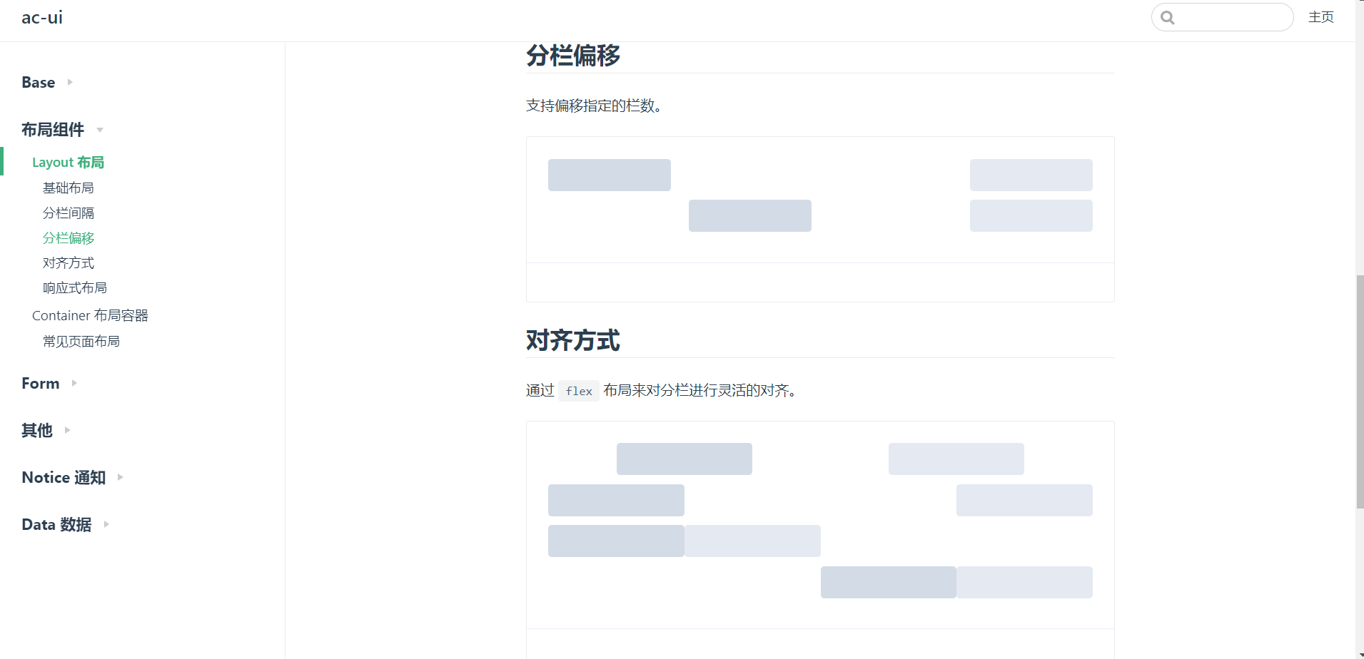
</style>Layout 布局组件
参考element-ui,有两个组件。
- 一个
row代表行 - 一个
col代表列
分析一下行的作用,控制元素的 排列方式,元素直接的距离等,再把里面内容展现出来
列的作用 需要控制自己所占大小,偏移。响应等
接下来开始实现。
row
<template>
  <div class="ac-row" :style="rowStyle">
    <slot></slot>
  </div>
</template>

<script>
  export default {
    name: 'ac-row',
    props:{
      gutter:{
        type:Number,
        default:0
      },
      justify:{
        type: String,
        validator(type){
          if (type && !['start', 'end', 'content', 'space-around', 'space-between'].includes(type)) {
            console.error('type类型必须是' + ['start', 'end', 'content', 'space-around', 'space-between'].join(','))
          }
          return true
        }
      }
    },
    mounted() {
      this.$children.forEach(child=>{
        child.gutter = this.gutter
      })
    },
    computed:{
      rowStyle(){
        let style={}
        if (this.gutter){
          style = {
            ...style,
            marginLeft: -this.gutter/2 + 'px',
            marginRight: -this.gutter/2 + 'px'
          }
        }
        if (this.justify){
          let key = ['start','end'].includes(this.justify)?`flex-${this.justify}`:this.justify
          style = {
            ...style,
            justifyContent:key
          }
        }
        return style
      }
    }
  }
</script>

<style lang="scss">
.ac-row{
  display: flex;
  flex-wrap: wrap;
  overflow: hidden;
}
</style>
html结构简单,就是把传入的呈现出来。props方面也比较简单,有一个 自定义校验器。前面也说过了。解释一下其他的
mounted。里面 获取所有子元素,吧gutter赋给他们...style为什么要解构,防止里面有样式- 这里直接使用了 flex布局。有精力得小伙伴可以再补充一下浮动
col
<template>
  <div class="ac-col" :class="colClass" :style="colStyle">
    <slot></slot>
  </div>
</template>

<script>
  export default {
    name: 'ac-col',
    data(){
      return {
        gutter:0
      }
    },
    props:{
      span:{
        type:Number,
        default:24
      },
      offset:{
        type: Number,
        default: 0
      },
      xs:[Number,Object],
      sm:[Number,Object],
      md:[Number,Object],
      lg:[Number,Object],
      xl:[Number,Object],
    },
    computed:{
      colClass(){
        let classes = []
        classes.push(`ac-col-${this.span}`)
        if (this.offset){
          classes.push(`ac-col-offset-${this.offset}`)
        }
        ['xs','sm','md','lg','xl'].forEach(type =>{
          if (typeof this[type] === 'object'){
            let {span,offset} = this[type]
            span && classes.push(`ac-col-${type}-${span}`) // ac-col-xs-1
            offset && classes.push(`ac-col-${type}-offset-${offset}`) // ac-col-xs-offset-1
          }else {
    			//ac-col-xs-1
            this[type] && classes.push(`ac-col-${type}-${this[type]}`)
          }
        })
        return classes
      },
      colStyle(){
        let style={}
        if (this.gutter){
          style = {
            ...style,
            paddingLeft: this.gutter/2 + 'px',
            paddingRight: this.gutter/2 + 'px'
          }
        }
        return style
      }
    }
  }
</script>

<style lang="scss">
/*通过循环24来创造宽度    sass语法*/
@import "./../../styles/_var";
    /* 百分比布局*/
@import "./../../styles/mixin";
  @for $i from 1 through 24{
    .ac-col-#{$i}{
      width: $i/24*100%;
    }
    .ac-col-offset-#{$i}{
      margin-left: $i/24*100%;
    }
  }
    /*响应式布局*/
@each $key in ('xs','sm','md','lg','xl'){
  @for $i from 1 through 24{
    @include res($key){
      .ac-col-#{$key}-#{$i}{
        width: $i/24*100%;
      }
    }
  }
}
</style>
这段代码的核心就是: 通过计算属性把不同的class给加入到组件上
关于下面的 res 再上面通用代码里。就是一些sass的应用
Container 容器组件
容器组件就相对来说简单了。就是利用H5新标签。
里面使用了flex
aside
<template>
  <aside class="ac-aside" :style="`width:${width}`">
    <slot></slot>
  </aside>
</template>

<script>
  export default {
    name: 'ac-aside',
    props: {
      width: {
        type: String,
        default: '300px'
      }
    }
  }
</script>
main
<template>
<main class="ac-main">
<slot></slot>
</main>
</template>

<script>
  export default {
    name: 'ac-main'
  }
</script>

<style lang="scss">
.ac-main{
  flex: 1;
  padding: 20px;
}
</style>
header
<template>
  <header class="ac-header" :style="height">
    <slot></slot>
  </header>
</template>

<script>
  export default {
    name: 'ac-header',
    props: {
      height: {
        type: String,
        default: '60px'
      }
    }
  }
</script>

<style lang="scss">
  .ac-header {

  }
</style>
footer
<template>
  <footer class="ac-footer" :style="height">
    <slot></slot>
  </footer>
</template>

<script>
  export default {
    name: 'ac-footer',
    props: {
      height: {
        type: String,
        default: '60px'
      }
    }
  }
</script>

<style>
  .ac-footer {

  }
</style>
container
<template>
  <section class="ac-container" :class="{isVertical}">
    <slot></slot>
  </section>
</template>

<script>
  export default {
    name: 'ac-container',
    data() {
      return {
        isVertical: true
      }
    },
    mounted() {
      this.isVertical = this.$children.some(child=>
        ["ac-header", "ac-footer"].includes(child.$options.name)
      )
    }
  }
</script>

<style lang="scss">
  .ac-container {
    display: flex;
    flex-direction: row;
    flex: 1;
  }

  .ac-container.isVertical {
    flex-direction: column;
  }

</style>
input 输入框组件
参考element,应该有以下功能
- 可情况
- 密码展示
- 带图标的输入框
- 状态禁用
<template>
  <div class="ac-input" :class="elInputSuffix">
    <ac-icon :icon="prefixIcon"
             v-if="prefixIcon"
    ></ac-icon>
    <input :type="ShowPassword?(password?'password':'text'):type" :name="name" :placeholder="placeholder"
           :value="value"
           @input="$emit('input',$event.target.value)"
           :disabled="disabled" ref="input"
           @change="$emit('change',$event)"
           @blur="$emit('blur',$event)"
           @focus="$emit('focus',$event)"
    >

    <!--    @mousedown.native.prevent 不会失去焦点-->
    <ac-icon icon="qingkong"
             v-if="clearable && value"
             @click.native="$emit('input','')"
             @mousedown.native.prevent
    ></ac-icon>
    <!--    先失去 再获取焦点-->
    <ac-icon icon="xianshimima"
             v-if="ShowPassword && value"
             @click.native="changeState"
    ></ac-icon>
    <ac-icon :icon="suffixIcon"
             v-if="suffixIcon"
    ></ac-icon>
  </div>
</template>

<script>
  export default {
    name: 'ac-input',
    data() {
      return {
        // 尽量不要直接更改 父组件传过来的值
        password: true
      }
    },
    props: {
      type: {
        type: String,
        default: 'text'
      },
      name: {
        type: String,
        default: null
      },
      placeholder: {
        type: String,
        default: '请输入内容'
      },
      value: {
        type: String,
        default: ''
      },
      disabled: {
        type: Boolean,
        default: false
      },
      clearable: {
        type: Boolean,
        default: false
      },
      ShowPassword: {
        type: Boolean,
        default: false
      },
        //  前后icon
      prefixIcon: {
        type: String
      },
      suffixIcon: {
        type: String
      }
    },
    computed: {
      elInputSuffix() {
        let classes = []
        if (this.clearable || this.ShowPassword || this.suffixIcon) {
          classes.push('ac-input-suffix-icon')
        }
        if (this.prefixIcon) {
          classes.push('ac-input-prefix-icon')
        }
        return classes
      }
    },
    methods: {
      changeState() {
        this.password = !this.password
        this.$nextTick(()=>{
          this.$refs.input.focus()
        })
      }
    }
  }
</script>

<style lang="scss">
  .ac-input {
    width: 180px;
    display: inline-flex;
    position: relative;

    input {
      border-radius: 4px;
      border: 1px solid #dcdfe6;
      color: #606266;
      height: 40px;
      line-height: 40px;
      outline: none;
      padding: 0 15px;
      width: 100%;

      &:focus {
        outline: none;
        border-color: #409eff;
      }

      &[disabled] {
        cursor: not-allowed;
        background-color: #f5f7fa;
      }
    }
  }

  .ac-input-suffix-icon {
    .ac-icon {
      position: absolute;
      right: 6px;
      top: 7px;
      cursor: pointer;
    }
  }

  .ac-input-prefix-icon {
    input {
      padding-left: 30px;
    }

    .ac-icon {
      position: absolute;
      left: 8px;
      top: 12px;
      cursor: pointer;
      width: 16px;
      height: 16px;
    }
  }
</style>
先看以下html的代码结构发现并不难,利用v-if控制 ac-icon的隐藏。利用props传入属性来控制。计算属性控制class的添加
特别注意。记得在组件上写@xxx="$emit('xxx',$event)"。否则父类触发不了事件
Upload 上传组件
html结构
<template>
  <div class="ac-upload">
    <upLoadDrag v-if="drag" :accpet="accept" @file="uploadFiles">
    </upLoadDrag>
    <template v-else>
      <div @click="handleClick" class="ac-upload-btn">
        <slot></slot>
        <!--      https://developer.mozilla.org/zh-CN/docs/Web/HTML/Element/Input/file 参考-->
        <input class="input" type="file" :accept="accept" :multiple="multiple" :name=name
               ref="input" @change="handleChange">
      </div>
    </template>
 <!--      提示文字-->
    <div>
      <slot name="tip"></slot>
    </div>
 <!--      文件列表 -->
    <ul>
      <li v-for="(file,index) in files" :key="files.uid">
        <div class="list-item">
          <ac-icon icon="file"></ac-icon>
          {{ file.name }}
          <ac-progress v-if="file.status === 'uploading'" :percentage="file.percentage"></ac-progress>
          <ac-icon icon="cuowu" @click.native="confirmDel(index)"></ac-icon>
        </div>
      </li>
    </ul>
  </div>
</template>
upLoadDrag在后面拖拽上传
type = file时 参考
解释一下 html结构
- 根据传入
drag,判断是否需要拖拽上传 - 文件列表。 根据不同的状态来决定是否显示
progress
js css 结构
css就几行。所以就直接写在这里面了
props解释
name输入框提交到后台的名字action提交地址:limit限制提交个数accept类型:on-exceed超过提交个数 会执行次方法:on-change上传文件发生状态变化 会触发 选择文件 上传成功等:on-success上传成功时候触发:on-error上传失败时候触发:on-progress上传过程中时候触发:before-upload上传之前触发的函数:file-list上传文件列表httpRequest提供上传方法,例如aixos默认ajax
JS可能这一长串代码可能看的会头疼。我先来串一下流程。
- 首先把
input隐藏。点击div。触发handleClick方法,作用清空值,并且clickinput - 选择文件后触发
changehandleChange事件。 获取文件列表, 开始准备上传 uploadFiles方法,获取文件个数,通过handleFormat格式化文件,然后通过upload上传upload判断是否有beforeUpload传入,传入执行,没有就上传post整合参数,开始上传。
<script>
  import upLoadDrag from './upLoad-drag'
  import ajax from './ajax' // 自己写的原生ajax

  export default {
    name: 'ac-upload',
    props: {
      name: {
        type: String,
        default: 'file'
      },
      action: {
        type: String,
        require: true
      },
      limit: Number,
      fileList: {
        type: Array,
        default: ()=>[]
      },
      accept: String,
      multiple: Boolean,
      onExceed: Function,
      onChange: Function,
      onSuccess: Function,
      onError: Function,
      onProgress: Function,
      beforeUpload: Function,
      httpRequest: {  // 提供上传方法 默认ajax
        type: Function,
        default: ajax
      },
      drag: {
        type: Boolean,
        default: false
      }
    },
    data() {
      return {
        tempIndex: 0,
        files: [],
        reqs: {}
      }
    },
    components: {
      upLoadDrag
    },
    watch: { // 监控 当传入得时候 把用户原来得文件也放到files里面 并且格式化
      fileList: {
        immediate: true,
        handler(fileList) {
          this.files = fileList.map(item=>{
            item.uid = Date.now() + this.tempIndex++
            item.status = 'success'
            return item
          })
        }
      }
    },
    methods: {
      handleClick() {
        console.log(1)
        // 点击前先清空 防止多次点击
        this.$refs.input.value = ''
        this.$refs.input.click()
      },
      handleChange(e) {
        // console.log(e) 从中 target 可以找到
        const files = e.target.files
        console.log(files)
        this.uploadFiles(files)
      },
      // 格式化
      handleFormat(rawFile) {
        rawFile.uid = Math.random() + this.tempIndex++
        let file = { // 格式化信息
          uid: rawFile.uid,  //id
          status: 'ready',   // 状态
          name: rawFile.name, //  名字
          raw: rawFile, //   文件
          size: rawFile.size,
          percentage: 0 //上传进度
        }
        // 把当前用户 上传得文件放到列表中 一会要 展示出来
        this.files.push(file)
        // 接下来 通知文件变化
        this.onChange && this.onChange(file)
      },
      upload(file) {
        // 开始上传
        // 如果没有限制 直接上传 有限制得话 要进行判断
        if (!this.beforeUpload) {
          console.log('上传')
          // 直接上传
          return this.post(file)
        }
        // 把文件传给函数进行校验 获取结果
        let result = this.beforeUpload(file)
        console.log(result)
        if (result) {  // 返回true 才有意义
          // 直接上传
          return this.post(file)
        }
      },
      uploadFiles(files) {
        // 判断上传个数
        if (this.limit && this.fileList.length + files.length > this.limit) {
          return this.onExceed && this.onExceed(files, this.fileList)
        }
        [...files].forEach(file=>{
          // 格式化文件  同一文件多次上传
          this.handleFormat(file)
          this.upload(file)
        })
      },
      getFile(rawFile) {
        return this.files.find(file=>file.uid === rawFile.uid)
      },
      handleProgress(ev, rawFile) {
        let file = this.getFile(rawFile)
        file.status = 'uploading'
        file.percentage = ev.percent || 0
        this.onProgress(ev, rawFile) // 触发用户定义
      },
      handleSuccess(res, rawFile) {
        let file = this.getFile(rawFile)
        file.status = 'success'
        this.onSuccess(res, rawFile)
        this.onChange(file)
      },
      handleError(err, rawFile) {
        let file = this.getFile(rawFile)
        file.status = 'fail'
        this.onError(err, rawFile)
        this.onChange(file)
        // 移除文件
        delete this.reqs[rawFile.uid]
      },
      post(file) {
        // 上传逻辑 调用上传方法
        // 整合一下参数  上传需要传递参数
        const uid = file.uid
        // 配置项
        const options = {
          file: file,
          fileName: this.name, // 传入得名字
          action: this.action,
          onProgress: ev=>{
            // 处理上传中得过程
            console.log('上传中', ev)
            this.handleProgress(ev, file)
          },
          onSuccess: res=>{
            // 处理上传成功后
            console.log('上传成功', res)
            this.handleSuccess(res, file)
          },
          onError: err=>{
            // 处理上传失败后
            console.log('上传失败', err)
            this.handleError(err, file)
          }
        }
        console.log(options)
        let req = this.httpRequest(options)
        // 把每一个ajax 存起来  可以取消清求
        this.reqs[uid] = req //
        //  判断结果  如果返回得是一个promise
        if (req && req.then) {
          req.then(options.onSuccess, options.onError)
        }
      },
      confirmDel(index){
        let res = confirm('确认删除吗')
        console.log(this.files[index])

        if (res){
          this.files.pop(index)
        }
      }
    }
  }
</script>

<style lang="scss">
  .ac-upload {
    .ac-upload-btn {
      display: inline-block;
    }

    .input {
      display: none;
    }
  }
</style>
拖拽上传
相比上面,这里面就是改了一些 把click 改成了drop
还有一些文件
<template>
<!--  @drop.prevent="onDrop" 松手之后   阻止默认行为 防止打开文件
      @dragover.prevent      划过
      @dragleave.prevent      离开
-->
    <div class="ac-upload-drag"
         @drop.prevent="onDrag"
         @dragover.prevent
         @dragleave.prevent
    >
      <ac-icon icon="shangchuan"></ac-icon>
      <span>将文件拖拽到此区域</span>
    </div>
</template>

<script>
  export default {
    name: 'upLoad-drag',
    props:{
      accept:{
        type:String
      }
    },
    methods:{
      onDrag(e){
        if (!this.accept){
          this.$emit('file',e.dataTransfer.files)
        }else {
          // 自己过滤  过滤之后再次发送
          this.$emit('file',e.dataTransfer.files)
        }

      }
    }
  }
</script>

<style lang="scss">
.ac-upload-drag{
  background-color: #fff;
  border: 1px dashed #d9d9d9;
  border-radius: 6px;
  width: 360px;
  height: 180px;
  cursor: pointer;
  position: relative;
  display: flex;
  align-items: center;
  justify-content: center;
  flex-direction: column;
  .ac-icon{
    width: 50px;
    height: 70px;
  }
}
</style>
原生ajax
export default function ajax(options) {
  // 创建 对象
  const xhr = new XMLHttpRequest()
  const action = options.action

  const fd = new FormData() // H5上传文件API
  fd.append(options.fileName,options.file)
  // console.log(options.fileName,options.file)

  // console.log('文件名'+options.fileName,options.file)

  xhr.onerror = function (err){
    options.onError(err) // 触发错误回调
  }

  // 上传完毕后走这个方法 H5 api
  xhr.onload = function (){
    let text = xhr.response || xhr.responseText
    options.onSuccess(JSON.parse(text))
  }

  xhr.upload.onprogress = function(e){
    if (e.total > 0){
      e.percent = e.loaded/e.total * 100
    }
    options.onProgress(e)
  }

  // 开启清求
  xhr.open('post',action,true)

  // 发送清求
  xhr.send(fd)
  return xhr
}
DatePick 日历组件
日历组件的 结构不是很难。难得是 要去计算时间
思路解释一下
input聚焦后,执行handleFocus函数,显示下面得日历框。点击div外面。执行handleBlur。关闭日历框- 接下来是
content的里面的。显示头部,4个icon外加时间显示 - 接下来时日历和时间
最主要难得就时时间的显示。得一步一步算。
每个人的计算方式不一样。这里只给一个参照。
<template>
  <div class="ac-date-pick" v-click-outside="handleBlur">
    <ac-input suffix-icon="rili" @focus="handleFocus" :value="formatDate" placeholder="请选择时间"
              @change="handleChange"></ac-input>
       <!--    content    -->
    <div class="ac-date-content" v-show="show">
      <div class="ac-date-pick-content">
          <!--    dates    -->
        <template v-if="mode === 'dates'">
          <div class="ac-date-header">
            <ac-icon icon="zuoyi" @click="changeYear(-1)"></ac-icon>
            <ac-icon icon="zuo" @click="changeMonth(-1)"></ac-icon>
            <span><b @click="mode='years'">{{ TemTime.year }}</b>年 <b @click="mode='months'">{{ TemTime.month+1 }}</b> 月</span>
            <ac-icon icon="you" @click="changeMonth(1)"></ac-icon>
            <ac-icon icon="youyi1" @click="changeYear(1)"></ac-icon>
          </div>
          <div>
            <span v-for="week in weeks" :key="week" class="week">{{ week }}</span>
          </div>
          <div v-for="i in 6" :key="`row_${i}`">
           <span v-for="j in 7" :key="`col_${j}`" class="week date-hover"
                 @click="selectDay(getCurrentMonth(i,j))"
                 :class="{
             isNotCurrentMonth: !isCurrentMonth(getCurrentMonth(i,j)),
             isToday:isToday(getCurrentMonth(i,j)),
             isSelect:isSelect(getCurrentMonth(i,j))
           }">
             {{getCurrentMonth(i,j).getDate()}}
           </span>
          </div>
        </template>
          <!--    months    -->
        <template v-if="mode === 'months'">
          <div class="ac-date-header">
            <ac-icon icon="zuoyi" @click="changeYear(-1)"></ac-icon>
            <span>
              <b @click="mode='years'">{{ this.TemTime.year }}</b>年
            </span>
            <ac-icon icon="youyi1" @click="changeYear(1)"></ac-icon>
          </div>
          <div>
            <div>
              <span v-for="(i,index) in month" class="week date-hover year" @click="setMonth(index)">{{ i }}</span>
            </div>
          </div>
        </template>
<!--    years    -->
        <template v-if="mode === 'years'">
          <div class="ac-date-header">
            <ac-icon icon="zuoyi" @click="changeYear(-10)"></ac-icon>
            <span>
              <b @click="mode='years'">{{ startYear() }}</b>年-
              <b @click="mode='years'">{{ startYear()+10 }}</b>年
            </span>
            <ac-icon icon="youyi1" @click="changeYear(10)"></ac-icon>
          </div>
          <div>
            <div>
              <span v-for="i in showYears" class="week date-hover year"
                    @click="setYear(i)"
              >{{ i.getFullYear() }}</span>
            </div>
          </div>
        </template>
      </div>
    </div>
  </div>
</template>

<script>
  function getTime(date) {
    let year = date.getFullYear()
    let month = date.getMonth()
    let day = date.getDate()
    return [year, month, day]
  }

  import clickOutside from 'v-click-outside'

  export default {
    name: 'ac-date-pick',
    data() {
      let [year, month, day] = getTime(this.value || new Date())
      return {
        show: false,
        mode: 'dates',
        weeks: ['日', '一', '二', '三', '四', '五', '六'],
        month: ['一月', '二月', '三月', '四月', '五月', '六月', '七月', '八月', '九月', '十月', '十一月', '十二月'],
        time: { // 负责展示
          year, month, day
        },
        TemTime: { // 临时时间 修改这个 因为time 是通过父级传入的值计算出来的 负责修改
          year, month, day
        }
      }
    },
    watch: {
      value(newValue) {
        console.log(newValue)
        let [year, month, day] = getTime(newValue)
        console.log(year, month, day)
        this.time = {
          year, month, day
        }
        this.TemTime = { ...this.time }
      }
    },
    computed: {
      showDate() {
        let firstDay = new Date(this.TemTime.year, this.TemTime.month, this.TemTime.day)
        // console.log(firstDay)
        let weekDay = firstDay.getDay() // 获取周几  0 - 6
        // console.log(weekDay)
        let day = firstDay.getDate()
        // console.log(parseInt((day - weekDay) / 7) + 1)
        weekDay = weekDay === 0 ? 7 : weekDay
        let start = firstDay - weekDay * 1000 * 60 * 60 * 24 - 7 * (parseInt((day - weekDay) / 7) + 1) * 1000 * 60 * 60 * 24
        let arr = []
        for (let i = 0; i < 42; i++) {
          arr.push(new Date(start + i * 1000 * 60 * 60 * 24))
        }
        return arr
      },
      showYears(){
        let arr = []
        for (let i = 0; i < 10; i++) {
          let startYear = new Date(this.startYear(),1)
          arr.push(new Date(startYear.setFullYear(startYear.getFullYear() + i)))
        }
        return arr
      },
      formatDate() {
        if (this.value) {
          console.log('这个是为了确认父级是否传值。不传就不渲染input里面的值')
          // padStart  padEnd 补全长度的功能。如果某个字符串不够指定长度,会在头部或尾部补全
          return `${ this.time.year }-${ (this.time.month + 1 + '').padStart(2, 0) }-${ (this.time.day + '').padStart(2, 0) }`
        }
      }
    },
    directives: {
      clickOutside: clickOutside.directive
    },
    props: {
      value: [String, Date],
      default: ()=>new Date()
    },
    methods: {
      handleFocus() { // 控制点击输入框弹出浮层
        this.show = true
        console.log('focus')
      },
      handleBlur() { //  当点击 div外侧的时候 隐藏浮层
        this.show = false
        this.mode = 'dates'
        console.log('Blur')
      },
      getCurrentMonth(i, j) {
        return this.showDate[(i - 1) * 7 + (j - 1)]
      },
      getTenYears(i,j){
        if (((i - 1) * 4 + (j - 1)) < 10){
          return this.showYears[(i - 1) * 4 + (j - 1)]
        }
      },
      isCurrentMonth(date) {
        let { year, month } = this.TemTime
        let [y, m] = getTime(date)
        // console.log(year,month)
        // console.log(y,m)
        return year === y && month === m
      },
      isToday(date) {
        let [year, month, day] = getTime(date)
        let [y, m, d] = getTime(new Date)
        return year === y && month === m && day === d
      },
      selectDay(date) {
        this.$emit('input', date)
        this.handleBlur()
      },
      isSelect(date) {
        let { year, month, day } = this.time
        let [y, m, d] = getTime(date)
        return year === y && month === m && day === d
      },
      changeYear(count) {
        let oldDate = new Date(this.TemTime.year, this.TemTime.month)
        let newDate = oldDate.setFullYear(oldDate.getFullYear() + count)
        let [year] = getTime(new Date(newDate))
        this.TemTime.year = year
        // this.TemTime.year += mount //这样改容易有bug
      },
      changeMonth(count) {
        let oldDate = new Date(this.TemTime.year, this.TemTime.month)
        let newDate = oldDate.setMonth(oldDate.getMonth() + count)
        let [year, month] = getTime(new Date(newDate))
        this.TemTime.year = year
        this.TemTime.month = month
      },
      handleChange(e) {
        console.log(e.target.value)
        let newValue = e.target.value
        let regExp = /^(\d{4})-(\d{1,2})-(\d{1,2})$/
        if (newValue.match(regExp)) {
          // console.log(RegExp.$1,RegExp.$2,RegExp.$3)
          this.$emit('input', new Date(RegExp.$1, RegExp.$2 - 1, RegExp.$3))
        } else {
          e.target.value = this.formatDate
        }
      },
      startYear() {
        return this.TemTime.year - this.TemTime.year % 10
      },
      setYear(date){
        this.TemTime.year = date.getFullYear()
        this.mode = 'months'
      },
      setMonth(index){
        this.TemTime.month = index
        this.mode = 'dates'
      }
    }
  }
</script>

<style lang="scss">
  @import "../../styles/var";
  @import "../../styles/mixin";

  .ac-date-pick {
    border: 1px solid red;
    display: inline-block;

    .ac-date-content {
      position: absolute;
      z-index: 10;
      user-select: none;
      width: 280px;
      background: #fff;
      box-shadow: 1px 1px 2px $primary, -1px -1px 2px $primary;

      .ac-date-header {
        height: 40px;
        @include flexSet()
      }

      .ac-date-pick-content {
        .week {
          width: 40px;
          height: 40px;
          display: inline-block;
          text-align: center;
          line-height: 40px;
          border-radius: 50%;
        }
        .year{
          width: 70px;
          height: 70px;
          line-height: 70px;
        }

        .date-hover:hover:not(.isNotCurrentMonth):not(.isSelect) {
          color: $primary;
        }

        .isNotCurrentMonth {
          color: #ccc;
        }

        .isSelect {
          background-color: $primary;
          color: #fff;
        }

        .isToday {
          background-color: #fff;
          color: $primary
        }
      }
    }
  }
</style>
Switch 开关组件
switch就相对简单一点。纯样式控制。input写到 label内,不需要写for了。通过伪类控制。
通过computed来控制class样式添加
<template>
  <div class="ac-switch">
    <span v-if="activeText" :class="{checkedText:!checked}">{{ activeText }}</span>
    <label class="ac-label" :style="labelStyle">
      <input type="checkbox" :checked="checked" @click="changCheck" :disabled="disabled">
      <span></span>
    </label>
    <span v-if="inactiveText" :class="{checkedText:checked}">{{ inactiveText }}</span>
  </div>
</template>

<script>
  export default {
    name: 'ac-switch',
    props: {
      value: {
        type: Boolean,
        default: false
      },
      activeText: String,
      inactiveText: String,
      activeColor:{
        type: String,
        default:'rgb(19, 206, 102)'
      },
      inactiveColor: String,
      disabled:{
        type: Boolean,
        default:false
      }
    },
    data() {
      return {
        checked: this.value
      }
    },
    methods: {
      changCheck() {
        this.checked = !this.checked
        this.$emit('input', this.checked)
      }
    },
    computed:{
      labelStyle(){
        let style = {}
        if (this.checked){
          style.backgroundColor = this.activeColor
        }else {
          style.backgroundColor = this.inactiveColor
        }
        if (this.disabled){
          style.cursor = 'not-allowed'
          style.opacity = 0.6
        }
        return style
      }
    }
  }
</script>

<style lang="scss">
  .ac-label {
    width: 40px;
    height: 20px;
    border-radius: 30px;
    overflow: hidden;
    vertical-align: middle;
    position: relative;
    display: inline-block;
    background: #ccc;
    box-shadow: 0 0 1px #36a6d4;

    input {
      visibility: hidden;
    }

    span {
      position: absolute;
      top: 0;
      left: 0;
      border-radius: 50%;
      background: #fff;
      width: 50%;
      height: 100%;
      transition: all linear 0.2s;
    }

    input:checked + span {
      transform: translateX(100%);
    }
  }
  .checkedText {
    color: #3a8ee6;
  }

</style>
infinteScroll 无限滚动指令
无限滚动不能作为一个组件。所以放成一个指令。参考地址
attributes自定义的默认属性getScrollContainer获取Scroll的容器元素getScrollOptions属性合并handleScroll控制是否Scroll
思路。 插入的时候 获取fn和vnode.再获取容器。获取参数。绑定事件。最后解除绑定
重点说一下 MutationObserver MDN
import throttle from 'lodash.throttle'
// 自定义属性
const attributes = {
  delay: {
    default: 200
  },
  immediate: {
    default: true
  },
  disabled: {
    default: false
  },
  distance: {
    default: 10
  },

}


/**
 *  获取Scroll的容器元素
 * @param el 元素节点
 * @returns {(() => (Node | null))|ActiveX.IXMLDOMNode|(Node & ParentNode)|Window}
 */
const getScrollContainer = (el)=>{
  let parent = el
  while (parent) {
    if (document.documentElement === parent) {
      return window
    }
    // 获取元素是否有 overflow属性
    const overflow = getComputedStyle(parent)['overflow-y']
    if (overflow.match(/scroll|auto/)) {
      return parent
    }
    parent = parent.parentNode
  }
}

/**
 * 拿到传入的属性和默认属性进行比对  合并
 * @param el 节点
 * @param vm  Vue实例
 * @returns {{}}  合并后的属性
 */
const getScrollOptions = (el, vm)=>{
  // entries参考网址 https://developer.mozilla.org/zh-CN/docs/Web/JavaScript/Reference/Global_Objects/Object/entries
  return Object.entries(attributes).reduce((map, [key, option])=>{
    let defaultValue = option.default
    let userValue = el.getAttribute(`infinite-scroll-${ key }`)
    map[key] = vm[userValue] ? vm[userValue] : defaultValue
    return map
  }, {})
}

const handleScroll = function(cb) {
  let { container, el, vm,observer } = this['infinite-scroll'] // 绑定了this
  let { disabled,distance } = getScrollOptions(el, vm)
  if (disabled) return
  let scrollBottom = container.scrollTop + container.clientHeight
  if (container.scrollHeight - scrollBottom <= distance){
    cb()
  }else {
    if (observer){ // 接触监控
      observer.disconnect()
      this['infinite-scroll'].observer = null
    }
  }
}

export default {
  name: 'infinite-scroll',

  inserted(el, bindings, vNode) { // vNode里面有context可以访问上下文
    // 插入 指令生效
    console.log('指令生效')
    console.log(bindings.value) // 获取到fn
    console.log(vNode.context) // 获取虚拟实例 里面有属性
    let cb = bindings.value
    let vm = vNode.context
    // 1. 开始寻找循环的容器
    let container = getScrollContainer(el)
    console.log(container)
    if (container !== window) {
      console.log('绑定事件')
      // 2. 获取Options
      let { delay, immediate } = getScrollOptions(el, vm)
      // 3. 执行函数 节流 增加滚动事件
      let onScroll = throttle(handleScroll.bind(el, cb), delay)
      el['infinite-scroll'] = {
        container,
        onScroll, el, vm
      }
      if (immediate) {
        const observe =el['infinite-scroll'].observer= new MutationObserver(onScroll)  // 观察页面是否继续加载
        observe.observe(container, {
          childList: true,  // 监控孩子列表发生变化
          subtree: true  // 当子dom元素 发生变化也触发
        })
        onScroll() // 默认先加载
      }

      container.addEventListener('scroll', onScroll)
    }
  },

  unbind(el) {
    // 解除
    const { container, onScroll } = el
    if (container) {
      container.removeEventListener('scroll', onScroll)
      el['infinite-scroll'] = {}
    }
  }
}
Message 通知组件
这里面有两个。为什么又两个,因为message是通过appendChild添加到Dom里面的
思路
- 通过
extend方法生成一个vue子类。然后通过$mount生成dom对象再添加到document options.close在element方法里不是这样写的还有一部分判断等。这里接直接偷懒了,能正常使用
index
- 因为可能要有多个
message。需要计算高度。所以使用了 数组存放。根据个数循环高度
import Vue from 'vue'
import MessageCom from './Message.vue';

let instances = []
// 生成一个vue 的 子类
let MessageConstructor = Vue.extend(MessageCom)

// 参考element 的写法  做了一定的修改和简化
const Message = (options)=>{
  options.close = function() {
    let length = instances.length
    instances.splice(0, 1);
    for (let i = 0; i < length - 1; i++) {
      let removedHeight = instances[i].$el.offsetHeight;
      let dom = instances[i].$el;
      dom.style['top'] =
        parseInt(dom.style['top'], 10) - removedHeight - 16 + 'px';
    }
  }
  let instance = new MessageConstructor({
    data: options,
  })
  instance.$mount()
  document.body.appendChild(instance.$el)

  let verticalOffset = 20;
  instances.forEach(item=>{
    verticalOffset += item.$el.offsetHeight + 16;  // 53 +16
  });
  instance.verticalOffset = verticalOffset;
  instance.visible = true
  instances.push(instance)
  return instance
}

// 加载 'warning', 'error', 'success', 'info' 等
['warning', 'error', 'success', 'info'].forEach(type=>{
  Message[type] = function(options) {
    options.type = type
    return Message(options)
  }
})


export default Message
message
这个里面没有什么较难的内容。基本就是样式的控制
<template>
  <transition name="ac-message-fade">
    <div v-show="visible"
         class="ac-message"
         :style="messageStyle"
         :class="MesClass"
    >
      {{ message }}
    </div>
  </transition>
</template>
<script>
  export default {
    name: 'Message',
    data() {
      return {
        message: '',
        type: '',
        visible: false,
        duration: 3000,
        verticalOffset: 0
      }
    },
    mounted() {
      if (this.duration > 0)
        setTimeout(()=>{
          this.$destroy() // 销毁当前实例
          // 销毁dom 元素
          this.$el.parentNode.removeChild(this.$el)
          this.close()
        }, this.duration)
    },
    computed: {
      messageStyle() {
        let style = {}
        style.top = this.verticalOffset + 'px'
        style.zIndex = 2000 + this.verticalOffset
        return style
      },
      MesClass() {
        const classes = []
        if (this.type) {
          classes.push(`ac-message-${ this.type }`)
        }
        return classes
      }
    }
  }
</script>
<style lang="scss">
  @import "../../styles/var";

  .ac-message {
    min-width: 380px;
    border-radius: 4px;
    border: 1px solid #ebeef5;
    position: fixed;
    left: 50%;
    background-color: #edf2fc;
    transform: translateX(-50%);
    transition: opacity .3s, transform .4s, top .4s;
    overflow: hidden;
    padding: 15px 15px 15px 20px;
    display: flex;
    align-items: center;
    @each $type, $color in (success:$success, error:$danger, warning:$warning, info:$info) {
      &-#{$type} {
        color: $color;
      }
    }
    &-success {
      background-color: #f0f9eb;
      border-color: #e1f3d8
    }
    &-warning {
      background-color: #fdf6ec;
      border-color: #faecd8
    }
    &-error {
      background-color: #fef0f0;
      border-color: #fde2e2
    }
  }

  .ac-message-fade-enter, .ac-message-fade-leave-active {
    opacity: 0;
    transform: translate(-50%, -100%)
  }

</style>
Popover 弹出框组件
这个组件跟Message差不多。并不难。主要对JS三大家族的的引用。获得元素位置。根据元素位置来确定popover的位置
@click.stop阻止事件冒泡
个人觉得这一部分写的有一点冗余。感觉可以用offset搞定全部的。但是没有使用。就先这样吧
<template>
  <div class="ac-popover" ref="parent">
    <!--    阻止事件冒泡-->
    <div class="ac-popover-content"
         v-show="show"
         :class="`popover-${this.placement}`"
         :style="position"
         ref="content"
         @click.stop>
      <h3 v-if="title">{{ title }}</h3>
      <slot>{{ content }}</slot>
      <div class="popover"></div>
    </div>
    <div ref="reference">
      <slot name="reference"></slot>
    </div>
  </div>
</template>

<script>
  const on = (element, event, handler)=>{
    element.addEventListener(event, handler, false)
  }
  const off = (element, event, handler)=>{
    element.removeEventListener(event, handler, false)
  }
  export default {
    name: 'ac-popover',
    data() {
      return {
        show: this.value,
        clientWidth: 0,
        offsetTop: 0,
        offsetLeft: 0
      }
    },
    props: {
      value: {
        type: Boolean,
        default: false
      },
      placement: {
        validator(type) {
          if (!['top', 'bottom', 'left', 'right'].includes(type)) {
            throw new Error('属性必须是' + ['top', 'bottom', 'left', 'right'].join(','))
          }
          return true
        }
      },
      width: {
        type: [String, Number],
        default: '200px'
      },
      content: {
        type: String,
        default: ''
      },
      title: {
        type: String,
        default: ''
      },
      trigger: {
        type: String,
        default: ''
      },
    },
    methods: {
      handleShow() {
        this.show = !this.show
      },
      handleDom(e) {
        if (this.$el.contains(e.target)) {
          return false
        }
        this.show = false
      },
      handleMouseEnter() {
        clearTimeout(this.time)
        this.show = true
      },
      handleMouseLeave() {
        this.time = setTimeout(()=>{
          this.show = false
        }, 200)
      }
    },
    watch: {
      show(value) {
        if (value && this.trigger === 'hover') {

          this.$nextTick(()=>{
            let content = this.$refs.content
            document.body.appendChild(content)
            on(content, 'mouseenter', this.handleMouseEnter)
            on(content, 'mouseleave', this.handleMouseLeave)
          })
        }
      }
    },
    computed: {
      position() {
        let style = {}
        let width
        if (typeof this.width === 'string') {
          width = this.width.split('px')[0]
        } else {
          width = this.width
        }
        if (this.trigger === 'click') {
          if (this.placement === 'bottom' || this.placement === 'top') {
            style.transform = `translate(-${ this.clientWidth / 2 }px,-50%)`
            style.right = `-${ width / 2 }px`
            // console.log(style.right)
          } else {
            style.top = '-21px'
          }
          if (this.placement === 'bottom') {
            style.top = '-100%'
          } else if (this.placement === 'top') {
            style.top = '200%'
          } else if (this.placement === 'left') {
            style.left = '104%'
          } else if (this.placement === 'right') {
            console.log('click'+this.offsetLeft)
            style.left = '-190%'
          }
        } else if (this.trigger === 'hover') {
          if (this.placement === 'bottom' || this.placement === 'top') {
            style.left = `${ this.offsetLeft - width / 2 }px`
            style.transform = `translateX(${ this.clientWidth / 2 }px)`
          } else {
            style.top = `${ this.offsetTop - 21 }px`
          }
          if (this.placement === 'bottom') {
            style.top = `${ this.offsetTop - 73 }px`
          } else if (this.placement === 'top') {
            style.top = `${ this.offsetTop + 49 }px`
          } else if (this.placement === 'left') {
            console.log(width)
            style.left = `${ this.offsetLeft + this.clientWidth + 7 }px`
          } else if (this.placement === 'right') {
            style.left = `${ this.offsetLeft - width - 6 }px`
          }
        }
        return style
      }
    },
    mounted() {
      let reference = this.$slots.reference
      console.log(this.$refs.parent.offsetLeft)
      this.offsetTop = this.$refs.parent.offsetTop
      this.offsetLeft = this.$refs.parent.offsetLeft
      this.clientWidth = this.$refs.reference.clientWidth
      if (reference) {
        // console.log(reference) // 获取dom节点
        this.reference = reference[0].elm
      }
      if (this.trigger === 'hover') {
        on(this.$el, 'mouseenter', this.handleMouseEnter)
        on(this.$el, 'mouseleave', this.handleMouseLeave)
      } else if (this.trigger === 'click') {
        on(this.reference, 'click', this.handleShow)
        on(document, 'click', this.handleDom)
      }
    },
    beforeDestroy() {
      off(this.$el, 'mouseenter', this.handleMouseEnter)
      off(this.$el, 'mouseleave', this.handleMouseLeave)
      off(this.reference, 'click', this.handleShow)
      off(document, 'click', this.handleDom)
    }
  }
</script>

<style lang="scss">
  .ac-popover {
    position: relative;
    display: inline-block;
  }

  .ac-popover-content {
    width: 200px;
    position: absolute;
    padding: 10px;
    top: 0;
    background-color: #fff;
    border-radius: 5px;
    box-shadow: -1px -1px 3px #ccc, 1px 1px 3px #ccc;
    z-index: 2003;

  }

  .popover {
    position: absolute;

    &::after, &::before {
      content: '';
      display: block;
      width: 0;
      height: 0;
      border: 6px solid #ccc;
      position: absolute;
      border-left-color: transparent;
      border-top-color: transparent;
      border-right-color: transparent;
    }

    &::after {
      border-bottom-color: #fff;
      /*https://www.runoob.com/cssref/css3-pr-filter.html*/
      filter: drop-shadow(0 -2px 1px #ccc);
    }
  }

  .popover-bottom {
    .popover {
      left: 50%;
      margin-left: -6px;
      bottom: 0;

      &::after, &::before {
        transform: rotate(180deg);
      }
    }
  }

  .popover-top {
    .popover {
      left: 50%;
      margin-left: -6px;
      top: -12px;
    }
  }

  .popover-left {
    .popover {
      top: 50%;
      margin-left: -6px;
      left: -6px;

      &::after, &::before {
        transform: rotate(-90deg);
      }
    }
  }

  .popover-right {
    .popover {
      top: 50%;
      margin-left: -6px;
      right: 0;

      &::after, &::before {
        transform: rotate(90deg);
      }
    }
  }
</style>
分页组件
分页组件。相比较难得地方就在。需要计算什么时候显示。什么时候不该显示。即pagers计算属性。吧这一部分理解了,基本也就没什么了/。主要是一个计算问题
<template>
  <ul class="ac-pagination">
    <li>
      <ac-icon icon="zuo" @click="select(currentPage - 1)" :class="{noAllow: currentPage === 1 }"></ac-icon>
    </li>
    <li><span :class="{active:currentPage === 1}" @click="select(1)">1</span></li>
    <li v-if="showPrev"><span>...</span></li>
    <li v-for="p in pagers" :key="p">
      <span :class="{active:currentPage === p}" @click="select(p)">
        {{p}}
      </span>
    </li>
    <li v-if="showNext"><span>...</span></li>
    <li><span :class="{active:currentPage === total}" @click="select(total)">{{ total }}</span></li>
    <li>
      <ac-icon icon="you" @click="select(currentPage + 1)" :class="{noAllow:currentPage===total}"></ac-icon>
    </li>
  </ul>
</template>

<script>
  export default {
    name: 'ac-pagination',
    data() {
      return {
        showPrev: false,
        showNext: false
      }
    },
    methods:{
      select(current){
        if (current  <1){
          current = 1
        }else if (current > this.total){
          current = this.total
        }else if (current !== this.currentPage){
          this.$emit('update:current-page',current)
        }
      }
    },
    props: {
      total: {
        type: Number,
        default: 1
      },
      pageCount: {
        type: Number,
        default: 7
      },
      currentPage: {
        type: Number,
        default: 1
      }
    },
    computed: {
      // 最多显示 7个
      // 1 2 3 4 5 6 ...10
      // 1  .。  3 4 5 6 7 .。。 10
      pagers() {
        // floor向下取整  ceil 向上取整
        let middlePage = Math.ceil(this.pageCount / 2)
        let showPrev = false
        let showNext = false
        if (this.total > this.pageCount) {
          if (this.currentPage > middlePage) {
            showPrev = true
          }
          if (this.currentPage < this.total - middlePage + 1) {
            showNext = true
          }
        }
        let arr = []
        if (showPrev && !showNext) {
          // 前面存在。。。
          let start = this.total - (this.pageCount - 2)
          for (let i = start; i < this.total; i++) {
            arr.push(i)
          }
        } else if (showNext && showPrev) {
          let count = Math.floor((this.pageCount - 2) / 2)
          for (let i = this.currentPage - count; i <= this.currentPage + count; i++) {
            arr.push(i)
          }
        } else if (!showPrev && showNext) {
          //  后面存在...
          for (let i = 2; i < this.pageCount; i++) {
            arr.push(i)
          }
        } else {
          for (let i = 2; i < this.total; i++) {
            arr.push(i)
          }
        }
        this.showPrev = showPrev
        this.showNext = showNext
        return arr
      }
    }
  }
</script>

<style lang="scss">
  .ac-pagination {
    li {
      user-select: none;
      list-style: none;
      display: inline-flex;
      vertical-align: middle;
      min-width: 35.5px;
      padding: 0 4px;
      background: #fff;
      .active {
        color: #3a8ee6;
      }
    }

    .noAllow{
      cursor: not-allowed;
    }
  }
</style>
table 表格组件
表格作为一个最常用的组件。
着重说一下 固定表头的做法
- 先获取到表头的
Dom - 空出一部份距离。再把
thead插入进包裹的地方 即可完成
<template>
  <div class="ac-table" ref="wrapper">
    <div class="table-wrapper" ref="tableWrapper" :style="{height}">
      <table ref="table">
        <thead>
        <tr>
          <th v-for="item in CloneColumn" :key="item.key">
            <div v-if="item.type && item.type === 'select'">
              <input type="checkbox" :style="{width: item.width + 'px'}" :checked="checkAll" ref="checkAll"
                     @click="checkAllStatus">
            </div>
            <span v-else>
            {{ item.title }}
            <span v-if="item.sortable" @click="sort(item,item.sortType)">
              <ac-icon icon="sort"></ac-icon>
            </span>
          </span>
          </th>
        </tr>
        </thead>
        <tbody>
        <tr v-for="(row,index) in CloneData" :key="index">
          <td v-for="(col,index) in CloneColumn" :key="index">
            <div v-if="col.type && col.type === 'select'">
              <input type="checkbox" :style="{width: col.width+'px'}" @click="selectOne($event,row)"
                     :checked="checked(row)">
            </div>
            <div v-else>
              <div v-if="col.slot">
                <slot :name="col.slot" :row="row" :col="col"></slot>
              </div>
              <div v-else>
                {{ row[col.key] }}
              </div>

            </div>
          </td>
        </tr>
        </tbody>
      </table>
    </div>
  </div>

</template>

<script>
  export default {
    name: 'ac-table',
    data() {
      return {
        CloneColumn: [],
        CloneData: [],
        checkedList: []
      }
    },
    created() {
      this.CloneColumn = [...this.columns]
      this.CloneData = [...this.data]
      this.CloneData = this.CloneData.map(item=>{
        item._id = Math.random()
        return item
      })
      this.CloneColumn = this.CloneColumn.map(item=>{
        item.sortType = item.sortType ? item.sortType : 0
        this.sort(item, item.sortType)
        return item
      })
    },
    props: {
      columns: {
        type: Array,
        default: ()=>[]
      },
      data: {
        type: Array,
        default: ()=>[]
      },
      height: {
        type: String
      }
    },
    methods: {
      checked(row) {
        return this.checkedList.some(item=>item._id === row._id)
      },
      selectOne(e, selectItem) {
        if (e.target.checked) {
          this.checkedList.push(selectItem)
        } else {
          //  没有标识  需要去除 添加标识
          this.checkedList = this.checkedList.filter(item=>item._id !== selectItem._id
          )
        }
        this.$emit('on-select', this.checkedList, selectItem)
      },
      checkAllStatus(e) {
        this.checkedList = e.target.checked ? this.CloneData : []
        this.$emit('on-select-all', this.checkedList)
      },
      sort(col, type) {
        let data = [...this.CloneData]
        if (type !== 0) {
          let key = col.key
          if (type === 1) {
            data.sort((a, b)=>{
              return a[key] - b[key]
            })
          } else if (type === 2) {
            data.sort((a, b)=>{
              return b[key] - a[key]
            })
          }
          this.CloneData = data
        }
        this.$emit('on-list-change', data, col.sortType)
        col.sortType = col.sortType === 1 ? 2 : 1
      }
    },
    computed: {
      checkAll() {
        return this.CloneData.length === this.checkedList.length
      }
    },
    watch: {
      checkedList() {
        if (this.CloneData.length !== this.checkedList.length) {
          if (this.checkedList.length > 0)
            return this.$refs.checkAll[0].indeterminate = true
        }
        this.$refs.checkAll[0].indeterminate = false
      }
    },
    mounted() {
      if (this.height) {
        let wrapper = this.$refs.wrapper
        let tableWrapper = this.$refs.tableWrapper
        let table = this.$refs.table

        let cloneTable = table.cloneNode()
        console.log(cloneTable)
        let thead = table.children[0]
        console.log(thead.getBoundingClientRect())
        tableWrapper.style.paddingTop = thead.getBoundingClientRect().height + 'px'

        cloneTable.style.width = table.offsetWidth + 'px'
        cloneTable.appendChild(thead)
        cloneTable.classList.add('fix-header')

        // 设置对其 querySelector获取文档种DOM元素
        let tds = table.querySelector('tbody tr').children
        console.log(tds)
        let ths = cloneTable.querySelector('thead tr').children
        tds.forEach((item, index)=>{
          ths[index].style.width = item.getBoundingClientRect().width + 'px'
        })
        wrapper.appendChild(cloneTable)
      }
    }
  }
</script>

<style lang="scss">
  .ac-table {
    position: relative;
    overflow: hidden;

    .fix-header {
      position: absolute;
      top: 0;
    }

    .table-wrapper {
      overflow-y: scroll;
    }

    table {
      border-collapse: collapse;
      border-spacing: 0;
      width: 100%;

      thead {
        th {
          background-color: #f8f8f9;
          white-space: nowrap;
        }
      }

      tbody {
        tr:hover {
          background-color: #7dbcfc;
        }
      }

      th, td {
        border-bottom: 1px solid #ddd;
        padding: 10px;
        text-align: left;
      }
    }
  }
</style>
Vuepress 配置
有关Vuepress不做过多的解释了。官网 直接进入正题
贴一下自己的
导航栏配置
总结
本篇文章介绍了部分组件的个人开发过程。学习到的
- 关于
sass语法的使用。 - 还有就是组件设计时考虑的全面与否
- 一些组件的设计遇到的麻烦。再阅读源码之后解决。一定的独立思考和解决能力
- 不同组件的写法。
Vuepress的配置
抒发迷茫
- 经常被打击。不知道未来到底需要作什么。
- 身为一个前端工程师。没有什么拿得出手的作品。
- 东西日新月异。有好多东西自己还有去学。小程序,
flutter等。感觉到有点累 - 优化策略 没接触或者实际操作过。
- 想去接触一下实际的工作。不想再去模仿。
- 继续加油吧
版权声明:著作权归作者所有。商业转载请联系作者获得授权,非商业转载请注明出处。 作者: 叫我阿琛 原文链接:https://juejin.im/post/6856213306920468493